product ·
Design at the Core of Context
Ali Hamandi · Sep 21, 2026 · 6 min read
Throughout human history, we have continuously invented and developed almost everything around the details of our lives. We kept working on things gradually and repeatedly until we reached the best possible outcome, one that created real value within the context of our lives.
And this was simply through applying what was “logical” within the context.
Today, we call this the product development lifecycle. What matters is that we were doing all of this long before its terminology and concepts were formally defined, even in their most basic form, because exploration and continuous improvement are simply embedded in our human nature.
Yet despite all the progress we have made, a real problem has remained in decision-making. Some of the things we were doing simply did not fit the details and context of our lives.
In my view, much of this comes back to one thing that we gradually started thinking less and less about: context.
Design Has Always Existed
Throughout human history, design has always existed, and it has always relied primarily on context and clear logic.
This was very visible in our cities, our homes, the way they were designed, and in the details of how we solved problems related to our environment and climate. We built within our capabilities, our available resources, and the realities around us.
But we gradually started paying less attention to all of this as globalization became more influential in shaping the way we think. This was especially visible in societies that did not have enough cultural content being produced and shared to create a media influence strong enough to preserve the details of everyday life within those societies, particularly over the past 50 years.
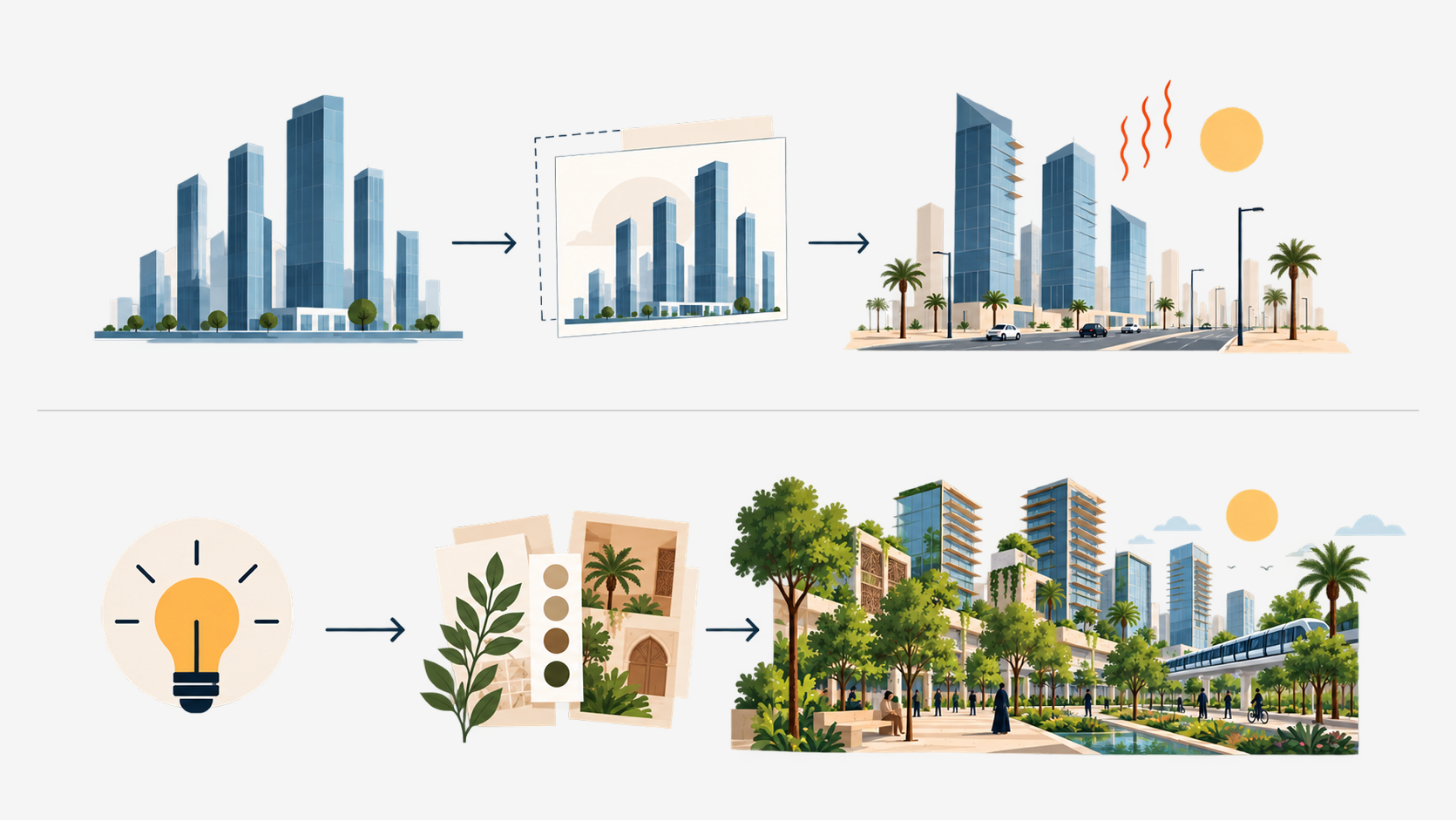
Gradually, we started turning our cities into places filled with glass skyscrapers, our homes into smaller spaces, and our gardens into empty areas covered with grass that does not naturally grow in our climate.

Over time, this became the new normal, and something that many people actively looked for, while we slowly started losing interest in our own context.
Of course, the impact was not limited to how our cities and lives looked. It developed into major functional problems in many of the things we built.
Our buildings started requiring enormous amounts of energy and money to cool, while our homes became harder to move through and make effective use of.
Even the digital products and applications we used required significant effort to market, introduce to users, and teach people how to use properly.
What we were often trying to do was copy an external experience exactly as it was, without making the contextual adjustments required for that experience to work properly.
Good Design Answers to Reality
Every great design throughout history was great because it worked within the right context, or because it created the right context for itself to work within.
Whether it was a product, a building, an application, a website, or a service, its use had to feel logical and well constructed, centered around its users and designed to meet their needs properly, or to introduce them to a pattern or behavior that could improve their experience of life.
It also had to work directly with the way we naturally think and behave as human beings.
To make this idea clearer, I have an example in mind from a financial application several years ago.
The team behind the product was working on a feature that created a major issue in how customers understood the experience. Fortunately, it was discovered during the early stages of the product development lifecycle.
Building a Financial Assessment for the User
The team was trying to build a complete process that would allow the company to create an accurate financial assessment of its customers, enabling them to gradually gain access to financial services according to the level of that assessment.
The first version of this assessment depended almost entirely on a few very simple questions designed to initiate communication with the customer. After that, the team would manually collect the remaining information, organize it, and use it to perform the financial assessment.
The goal of the new development was to move this process to a more advanced stage, allowing the company to make assessment decisions directly without requiring manual communication with the customer, with the eventual goal of turning the process into a fully automated one.
Facial Liveness Verification
One important part of the registration process was the “Liveness Check,” or facial liveness verification.
The user was required to record a three-second video. An automated model would then evaluate facial expressions and movement to help detect fraudulent customer applications and verify identity.
The video could also be reviewed by specialized team members when necessary, and then it will get deleted from the system entirely after the decision is made by the team.
Hypothesis One: Reduce Friction as Much as Possible
The team designing the process came up with an initial proposal to test with customers before the public launch.
The entire design was built around one objective:
“The registration process is long and complicated. We need to reduce
Interaction Frictionas much as possible, so the entire experience should feel smooth and highly familiar to the user.”
The team implemented this by designing the facial liveness verification interfaces in a way that felt similar to the process of setting up Face ID on an iPhone.
Everything that could matter to the customer was clearly presented within the interface, including privacy-related details and the possibility that the submitted data could be reviewed by specialized teams when necessary.
When tested with customers, the design was highly successful at reducing interaction friction.
Users were able to complete the process very smoothly and without any notable problems.
But the team noticed a problem.
Users were so familiar with the experience that they were not paying enough attention to its details.
They assumed that the video was simply another form of biometric data being used in a similar way to Face ID, so they were not paying attention to much of the information presented throughout the process.
As a result, the information they provided was not detailed or accurate enough, and they also treated the facial liveness verification step with relatively little attention.
Hypothesis Two: Clarity Matters More Than Smoothness Alone
After this first test with a limited number of users, the team introduced a second hypothesis:
“The registration process will determine the customer's financial assessment, and the quality of that assessment is directly affected by the quality of the data and the attention paid to its details. Therefore, every part of the process needs to be made clear enough to communicate its importance to the user and ensure that the required information is provided properly.”
The second hypothesis was implemented by making every part of the process much more explicit.
This was done through instructions, written content within the screens, and through the details of the product design itself, including buttons and other interface elements.
For example, buttons related to facial liveness verification used the label:
“Start Recording”
instead of simply:
“Start”
The process also included confirmation steps that clearly explained to users that the information could be reviewed by a specialized team.
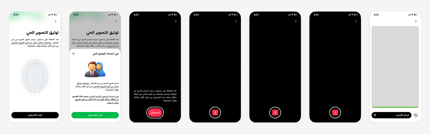
What the team noticed after testing the second design was that the quality of the submitted data improved significantly across all parts of the registration form.
Users also became much more attentive to how they entered their information.
These changes significantly reduced the time required to approve new users and also allowed them to gain access to more features within the application.
The reason was that better-quality information allowed the platform, the automated model, and the specialized team to produce better assessments of those users.
No Rule Exists Outside Context
What becomes clear from this example is how moving in a direction that was less familiar and somewhat contrary to common design principles actually created a better user experience.
It was more appropriate for the context of the product, its early versions, and its users. It helped users build their profiles correctly, while also helping the platform evaluate them properly.
In the end, when design was placed at the core of its context, it produced the best possible outcome.